Conceptual UI Redesign
Bleacher Report — Redesign
Conceptual iOS app redesign
A conceptual redesign addressing the three complaints B/R's own users kept repeating in their reviews: a cluttered interface, a credibility problem fueled by influencer content over reporting, and a sense the app had stopped innovating.
ROLE
Solo Project
TIMELINE
10 Weeks
TOOLS
Figma
Solo Project
UX Design
Visual Systems

THE PROBLEM
B/R's biggest audience opportunity is also its biggest liability.
The same complaints kept resurfacing across B/R's App Store reviews: a cluttered interface, influencer content over reporting, and a sense the app had stopped innovating.
"Horrible clunky interface. Finding scores for certain sports appear to be voodoo magic."
COMPLICATED UI · APP STORE REVIEW
28%
of Americans trust news media to report fully, accurately, and fairly, a record low.
GALLUP, SEPTEMBER 2025
Four main complaint categories surfaced from B/R's own App Store reviews.
COMPLICATED UI
Finding basic information like live scores felt needlessly difficult.
LACK OF CREDIBILITY
Influencer content and clip-based coverage stood in for actual reporting.
CONTROLLED NARRATIVES
Headlines leaned opinionated instead of factual, eroding trust in coverage.
POOR NOTIFICATION ALGORITHM
Alerts felt random and disconnected from what users actually cared about.
THE DEFINING QUESTION
How might we…
Rebuild B/R's mobile experience through better information architecture and editorial tone, without sacrificing the voice that built its audience?
THE SOLUTION
A revamped mobile experience tailored around trust, community, and simplicity.
Four screens carry the weight: Home, Search, Community, and Scores. Each one was rebuilt around a specific complaint from the research, not redesigned for its own sake.

The home hub, general sports news and information, got rebuilt around hierarchy.
Limited the repetitive infinite-scroll that buried what users actually came for, organizing the home page into three sections: main home, favorites, and trending.
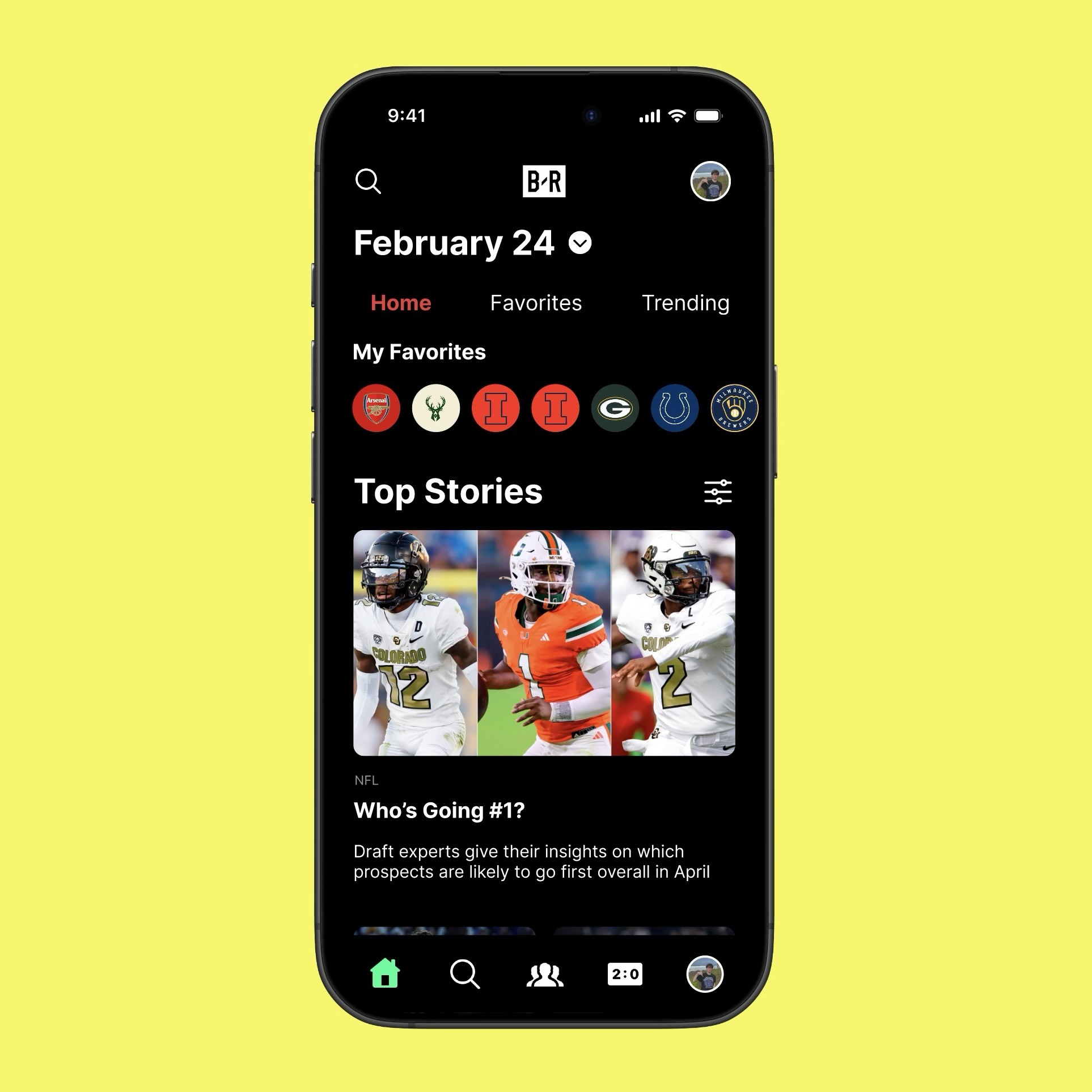
HOME TAB
Removed emojis and podcast clips to feel more professional.
Eliminated random podcast-clip content and emoji-laden headlines that made the app feel unreliable to the reviewers who complained about it.

HOME TAB - FAVORITES
A Favorites section built around what users actually follow.
Surfaces content tied to a user's favorite teams or players, even down to a single favorite, instead of mixing everything into one general feed.
Search is built around sorting and hierarchy to surface results fast.
Users can search for anything within the app using this tab, structured around clear sorting and hierarchy rather than a category-browsing layout.

SEARCH TAB
Results sorted by relevance instead of category tiles.
A hierarchy-driven layout surfaces the most relevant result first, rather than asking users to browse through categories to find it.
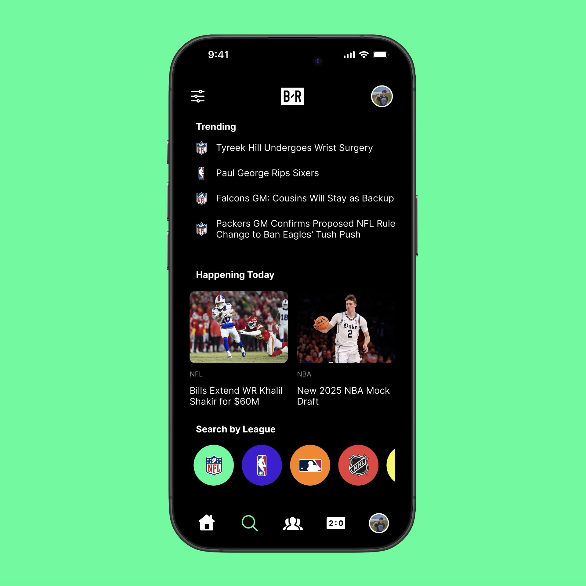
SEARCH TAB
Search for teams, players, articles, or scores, all in one place.
Gives search one clear, consistent entry point instead of scattering it across different parts of the app.
The Community Tab is what elevates B/R's experience for fans.
Games, quizzes, challenges, and polls sit alongside AR/VR experiences and team-exclusive content, with a trending-versus-latest toggle to switch between what's popular and what's new.

COMMUNITY TAB
Placed in the most prominent nav position: the center slot.
Interactive games and experiences for fans across the globe, directly answering the "stopped innovating" complaint from the research.
A scores tab dedicated to both favorite teams and general scores.
Where fans can find the scores of both their favorite team's games and general scores.

SCORES TAB
One tab, two views: favorite teams and general scores.
Gives scores a clear, dedicated home in an app the reviews described as confusing to navigate.
KEY DECISION
Shifting headline tone from opinionated to factual.
The credibility complaints all traced back to one thing: content that read like clickbait instead of reporting. The question was whether B/R's voice meant its tone or its trustworthiness.
IMPACT
What success would look like.
Reduced friction across every core flow
Rebuilt hierarchy, a familiar search pattern, and a dedicated scores tab remove the friction reviewers complained about most.
A stronger sense of community
Games, quizzes, and shared experiences turn passive scrolling into something fans actually participate in together.
Trust rebuilt through editorial tone
Factual headlines and less clickbait framing position B/R as a trustworthy source of sports reporting again.
THE PROCESS
Four parts built on each other: research into wireframes into brand into final UI.
Ten weeks solo, covering competitive research, wireframing, a visual identity system, and a final critique.
RESEARCH & STRATEGY
WIREFRAMES & NAVIGATION
BRAND, TONE & VOICE
FINAL UI & CRITIQUE
RESEARCH & STRATEGY
Competitive research and persona-building shaped every decision that followed.
Four research threads narrowed into three fixable problems: credibility, clutter, and stalled innovation, the throughline for everything that follows.
"All this app pushed is random people in clips talking about things... have fun watching nobodies and YouTubers forced on you 3/4 post."
LACK OF CREDIBILITY · APP STORE REVIEW
All three competitors compete on depth and speed — none build for community, which is exactly where B/R doubled down.

ESPN
The category benchmark for real-time scores, live stats, and breadth of coverage across every major league.

The Athletic
Subscription journalism built on long-form reporting and trusted bylines instead of aggregation.

OneFootball
International football coverage with a cleaner, less cluttered interface than most US-first apps.
Five personas, one clear primary user.
The Die-Hard drove the redesign: Favorites, the Community tab's central nav placement, and the dedicated Scores tab all serve that behavior pattern directly. The other four personas rounded out the research and kept the redesign honest about who else actually uses the app.
The Die-Hard — primary user
Daily real-time updates, deep discussion, and total attachment to their teams. Favorites, the Community tab's central nav placement, and the dedicated Scores tab were all built around this behavior pattern.
The Fantasy Expert
Needs real-time player stats and injury updates to manage a roster, especially in-season.
The Social Media Lover
Drawn to shareable clips, memes, and highlight reels over long-form reporting.
The Casual
Checks in for trending news and major highlights in an easy, visually digestible format.
The Newcomer
Learning the basics, following trending teams, and needing simplicity over depth.
WIREFRAMES & NAVIGATION
Five screens took shape after mapping what it would take to stay competitive.
Emphasizing community, gamification, and credible journalism were the core enhancements needed to remain competitive, alongside a revamped UI and AI-driven personalization.
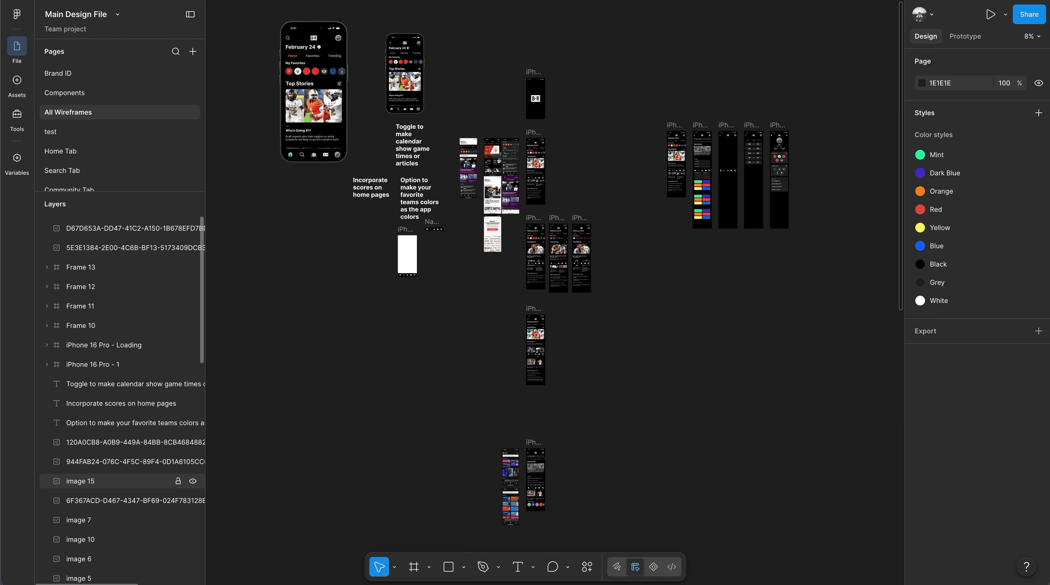
Three decisions shaped how the wireframes came together.
Five core screens
Home, Search, Community, Scores, and Profile, each one owns one job instead of trying to do everything at once.
Visual benchmarking
Studied real UI layouts and player data visualization patterns before sketching a single wireframe.
Needs vs. wants
Competitive necessities like credible journalism got priority over ambitious UX ideas like AI personalization, saved for later.
Every wireframe started as a hand-drawn sketch before going digital.
From Home to Profile, each screen went through low-fidelity sketches before becoming a digital wireframe.

BRAND, TONE & VOICE
A nine-color palette and typography system gave the redesign its own identity.
Beyond visual direction, this phase covered typography, iconography, and image style, everything that makes the redesign feel like a real, shippable product.
THE PALETTE
All nine colors come directly from B/R's own brand guidelines, but the redesign leans on the brighter highlight colors far more than B/R's current app does, keeping the identity familiar while making it feel far less flat. The full grid, spacing, and typography system lives in the project's Figma file.
FINAL UI & CRITIQUE
Three pain points became three fixes, presented as a finished product.
The final critique tied every design decision back to a specific complaint from the original research, proof the redesign solved real problems instead of chasing trends.
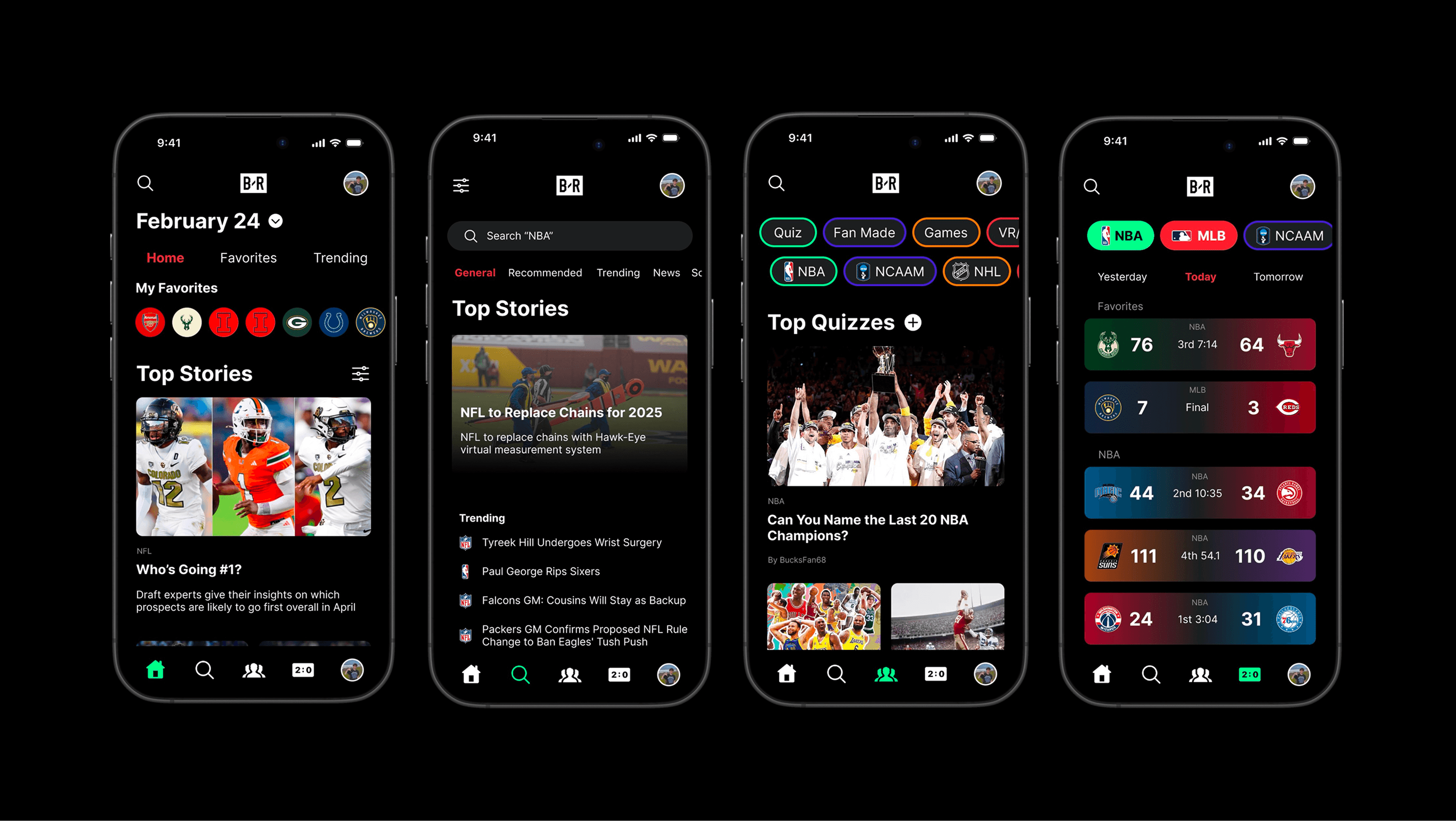
SCOPE NOTE
Four of the five wireframed tabs, Home, Search, Community, and Scores, were taken to final UI. Home alone covered multiple in-tab screens (main, favorites, and trending). Profile was scoped out due to time constraints and remained at wireframe stage.
MY ROLE
Solo, start to finish.
Research
Competitive benchmarking and persona development, drawn directly from B/R's own App Store reviews.
Wireframing & UX design
Sketched and digitized all five core screens, from low-fidelity to final wireframe.
Visual identity
Built the color palette, typography, iconography, and image style system from scratch.
Final UI design
Took every screen from wireframe to high-fidelity, and presented the full concept at final critique.
REFLECTION
Working alone meant every decision had to stand on its own reasoning, no team discussion to lean on before defending it at critique. That discipline, tracing every design choice back to a real complaint, is the habit I want to carry into team projects too.